
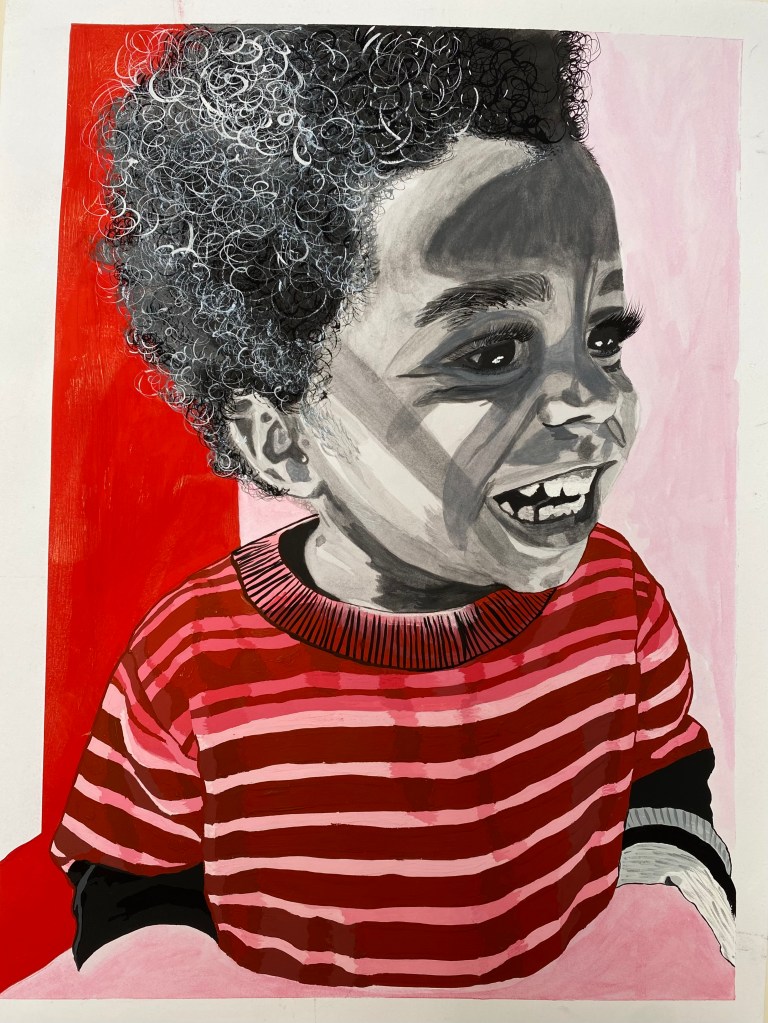
Back in Art & Design Fundamentals, we were given the task of creating a piece that explored both monochromatic and achromatic colour studies. Naturally, I chose my favourite subject: Ace. In the reference photo I used, he was enjoying his very first Starbucks drink — just for him — and the smile on his face was pure, unfiltered joy. But it wasn’t just the expression that drew me in. The way the afternoon light cast shadows across his face stopped me in my tracks. There was something so tender and poetic in that moment — and I knew I wanted to capture it.
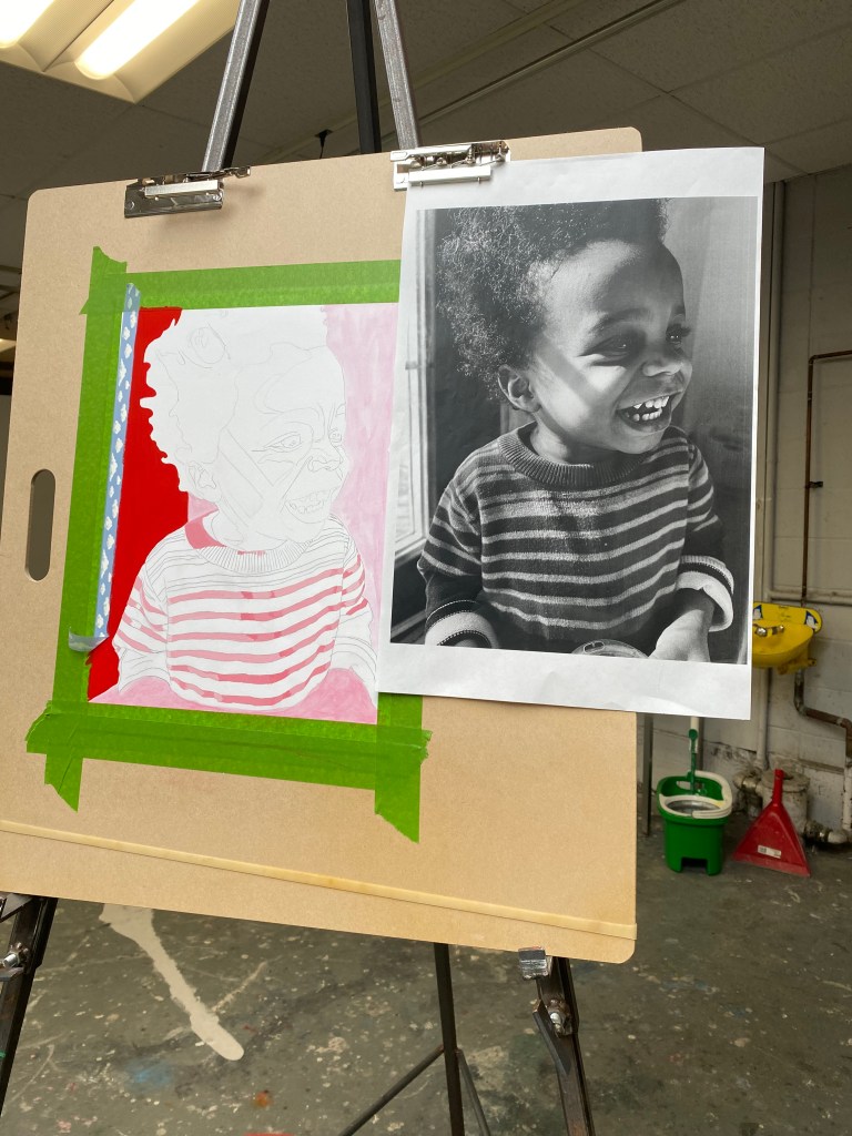
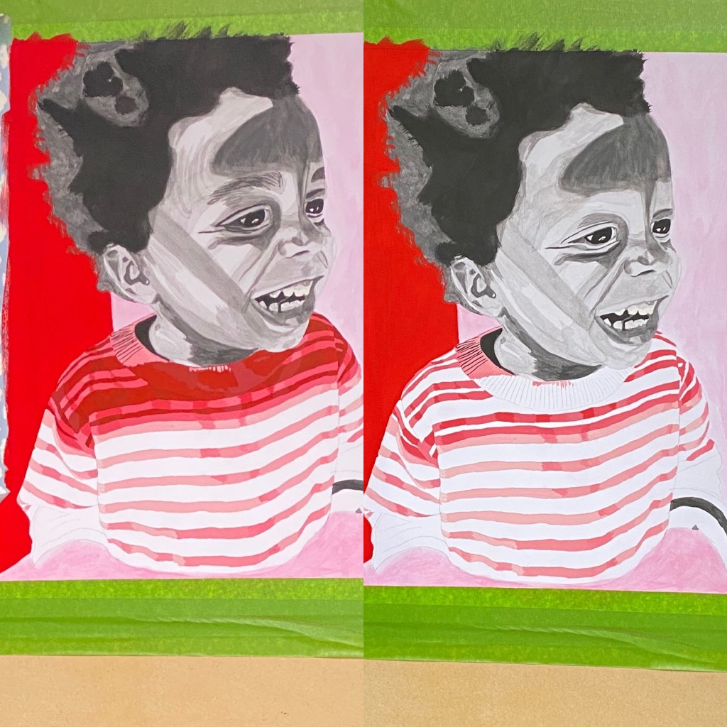
The black and white portion of the portrait was built up using watercolours from Beam Paints — a local, Indigenous, woman-owned company whose values and craftsmanship speak directly to my heart. Their paints are made from the earth, with natural pigments and thoughtful, eco-conscious packaging. Every brushstroke felt like a little act of love, not just toward the subject, but toward the process. I’d paint for a few hours, then spend the rest of the day (and night) just staring at it — studying, planning, dreaming. Each layer required patience and trust.
The red background and stripes on Ace’s shirt were done in acrylic — bold, bright, and full of life — just like him.
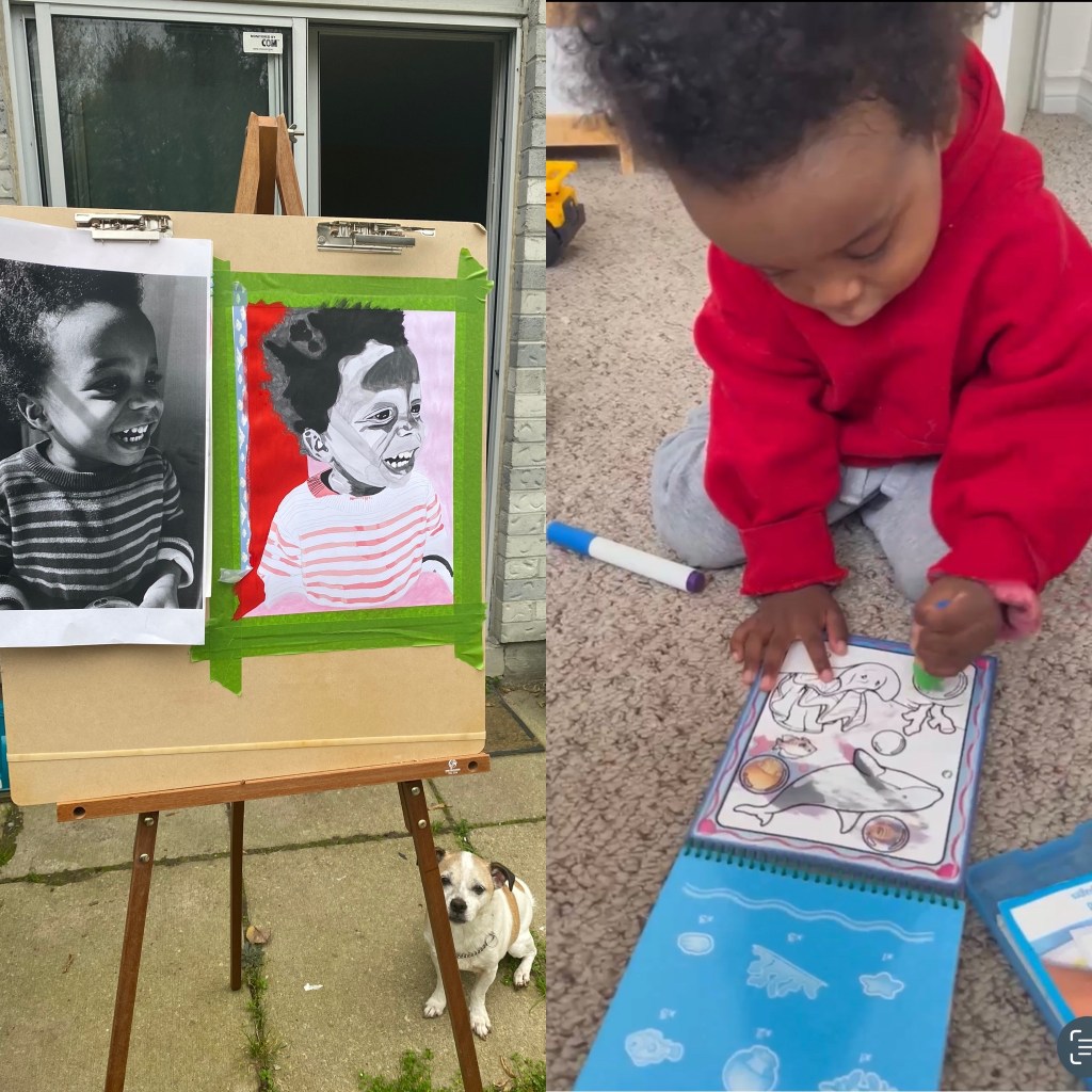
One afternoon while I was still working on the portrait, Ace and I were FaceTiming. He had his water-reveal painting book in front of him — the kind where you just brush on water and the colours magically appear — and he was so proud that we vwere painting together! And honestly? That moment hit me harder than any critique or classroom milestone. It reminded me that art isn’t just about technique or assignments — it’s about connection. Memory. Heart.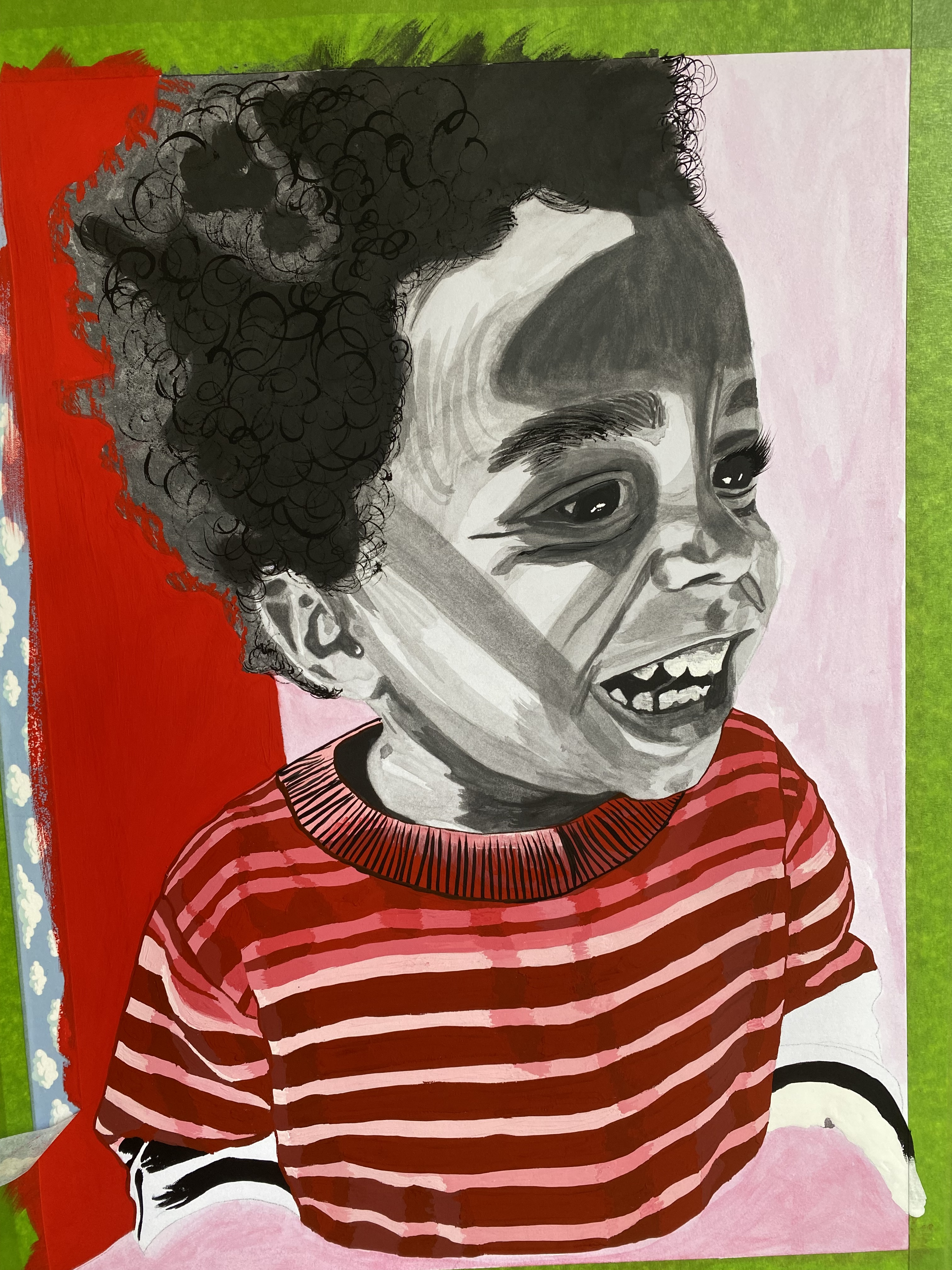
This painting is more than a study in contrast. It’s a memory made visible — one I’ll carry with me, always.

Leave a comment